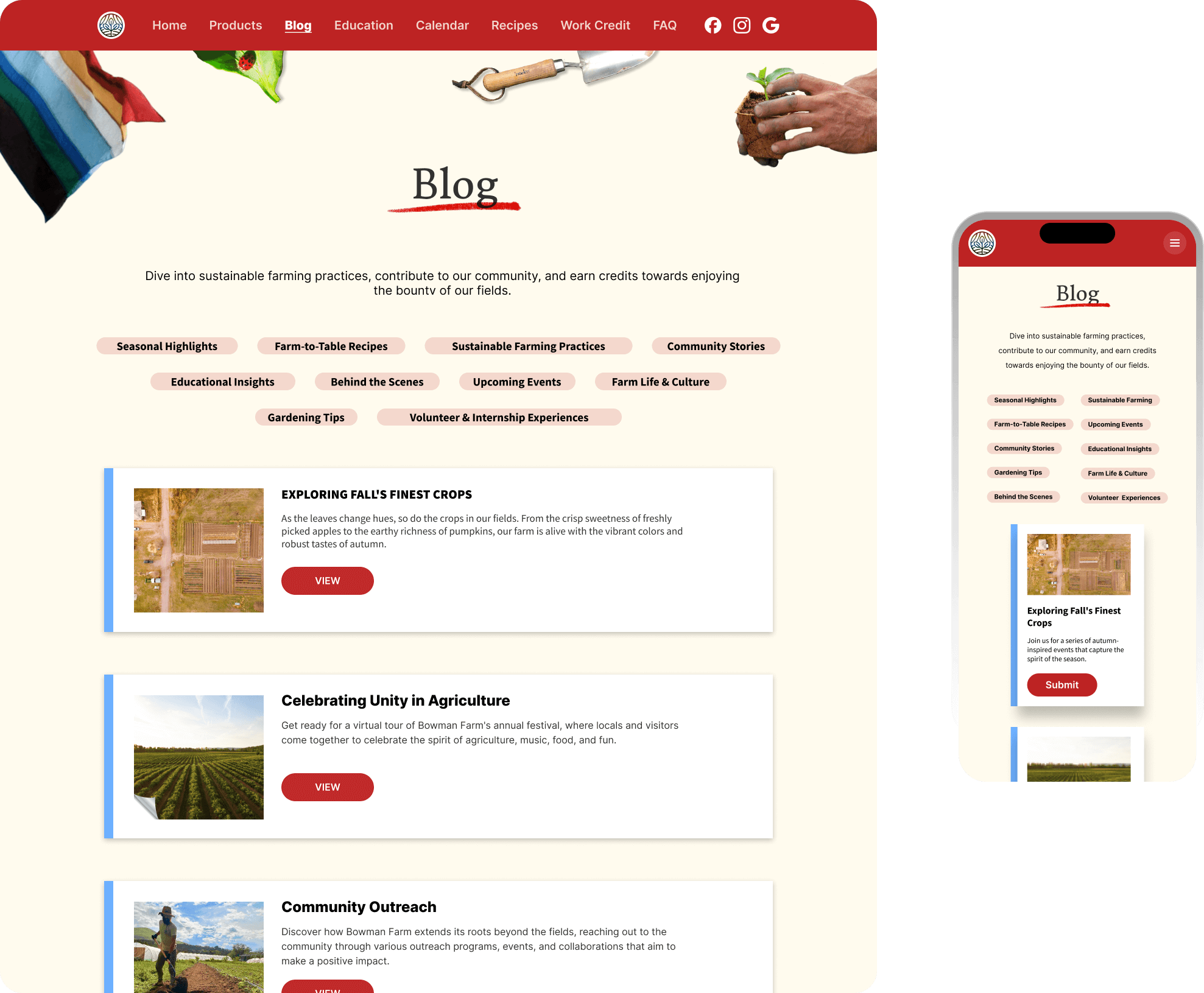
How I led the creation of the Bowman Farm Website, uniting intuitive architecture with immersive design.
Summary
In the competitive landscape of local agriculture and produce, I spearheaded a promotional campaign to elevate Bowman Farm's visibility. Our goal was both foundational and far-reaching: to craft an online identity that resonates authenticity and quality. This venture was rooted in a comprehensive analysis of market trends, followed by thorough research to inform every aspect of the promotion.
Every aspect of the Bowman Farm website was thoughtfully executed. From the user interface to the feature set, every element has been fine-tuned to offer an intuitive and immersive experience. The end result isn’t jsut another promotional website; it’s a proof of concept that a strong digital presence and community involvement can co-exist.
Roles
Responsibilities
Figma
Procreate
Heycollab
Google Slides
Strategy
Competitive Research
Quantitative Research
Qualitative Research
User Personas
UX & Visual Aids
Prototyping
Customer Engagement
Team Lead
UX Designer
UI Designer
Researcher
Tools
Challenge
Bowman Farm needed to distinguish itself in a market dense with generic produce options, where its genuine quality was overshadowed by the digital dominance of larger players.
Solution
We developed a streamlined promotional website for Bowman Farm, aimed at showcasing its authentic farm-to-table philosophy in a single, engaging digital space, enhancing its visibility and consumer connection.
Process
Market Research: Competitive
To gain insights into the digital presence of other local market farms, we carried out quantitative research focusing on four key areas: design trends, media presence, and community involvement.
Design Trends
Warm primary colors
Green secondary colors
Structured layout
Media Presence
Social Media Links
Google Presence
Tourist Friendly
Involvement
Activity Pages
Calendars
Market Research: Qualitative
I’ve conducted qualitative research to delve into human behaviors and attitudes. This has involved surveying prospects, holding user interviews, and synthesizing the gathered information.
I’ve used these insights to craft empathy maps and user personas, thereby gaining a nuanced understanding of user needs and motivations
Surveys
In my research, I polled 36 patrons of Bowman Farm to gauge the features and information they desire from a promotional site. The data was clear: every individual indicated they visited the site for three reasons.
Interviews
In the qualitative study, we conducted 5 interviews out of the 36 individuals surveyed, speaking with customers ranging from tourists to life-long patrons. Our aim was to understand their goals and challenges.
Synthesis
More purchase options
More suggestions for what to do with the produce.
A more detailed product list and descriptions.
Seasonal offerings and planting calendar.
A wide variety of recipes and tips.
Schedule of events and activities the farm is engaged in.
Payment variety like Paypal and Apple Pay.
Pickup and delivery options.
Farming and growing education.
Contact and location information for the farm and Market.
A deeper connection to the farm and its mission
Online ordering and delivery
Blog posts
Data showed the following suggestions:
Empathy Maps
Through categorizing interview-derived user pain points by thoughts and feelings, visual cues, spoken words, and actions, I was able to systematically organize each issue based on its distinct features.
Market Research: Qualitative
From interviews and user research, I developed user personas that outlined details like age range, occupation, and interests.
These profiles also highlighted commonly used apps, objectives, and pain points.
User Experience Design
User Experience Design is the scientific art of crafting the blueprint behind a product’s functionality.
It lays the groundwork for how a user interacts with a product by methodically planning its information architecture, sitemaps, user flows, and both low and high-fidelity wireframes.
This stage is crucial for vetting different hypotheses through usability testing, ensuring the product not only meets but exceeds user expectations.
Information Architecture
Information architecture played a pivotal role when we aimed to consolidate various functionalities, usually scattered across multiple products, into a single tool. We recognized early on that without meticulous planning, the tool would become too complex for easy adoption and usage.
User Flows
Armed with a well-defined sitemap that provided a macro-level view, we then honed in on mapping out the specific routes and user flows within the platform. This more granular focus allowed us to ensure a seamless navigation experience across the entire ecosystem.
Low-fidelity Wireframes
Low-fidelity wireframes serve as rapid iterations to vet the product’s functionality methodologies.
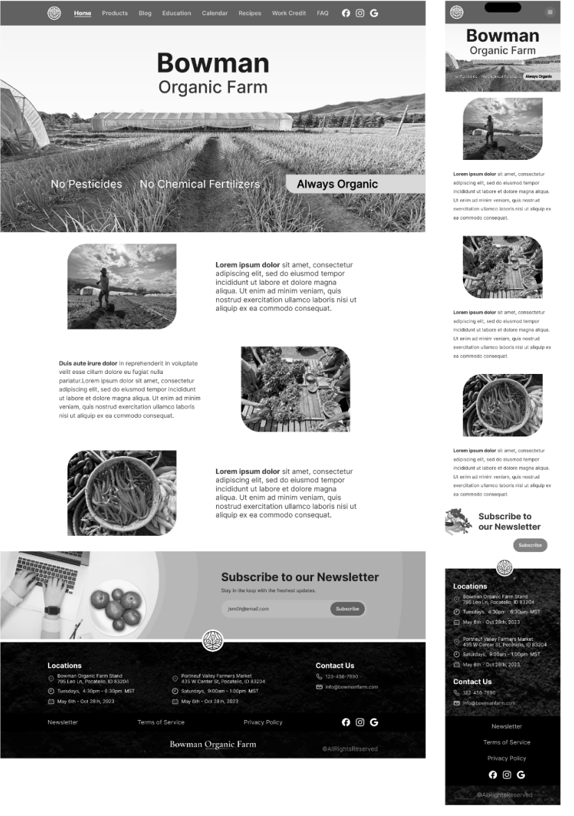
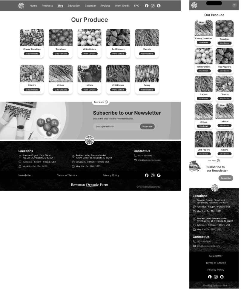
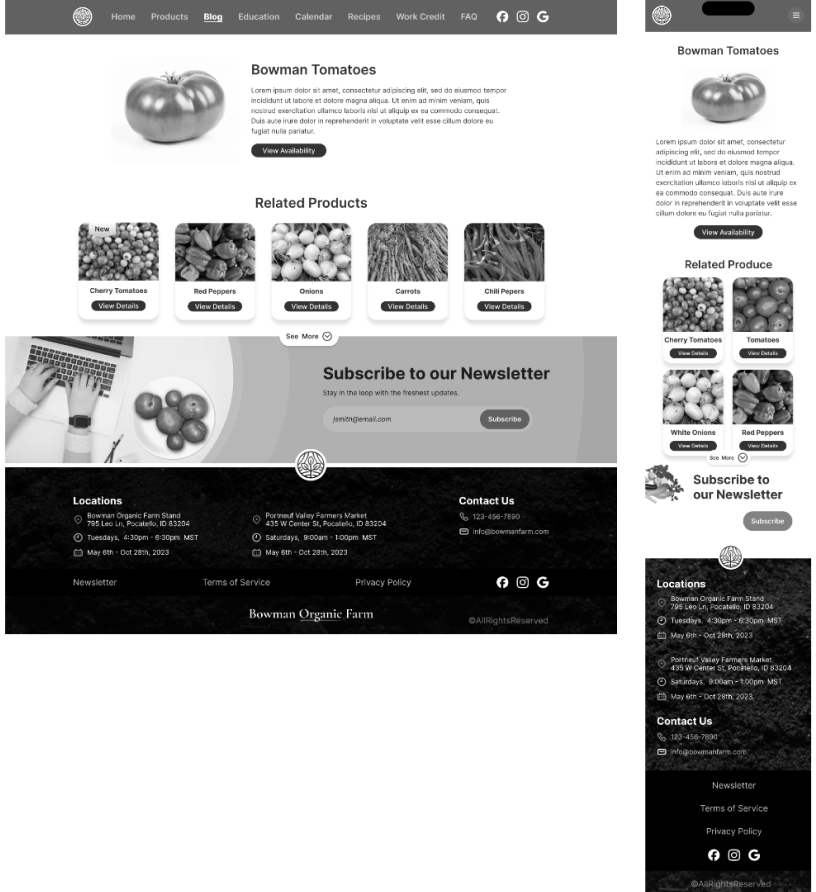
High-fidelity Wireframes
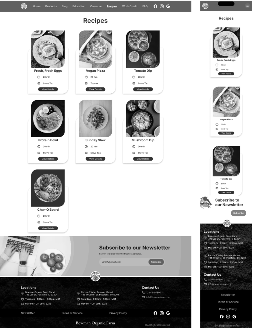
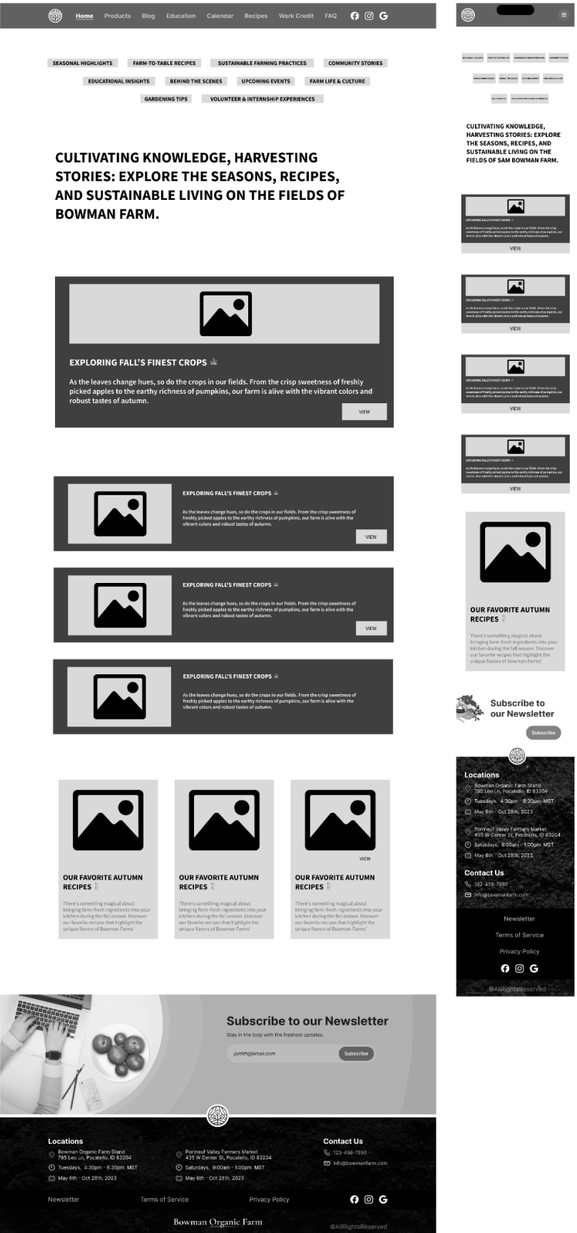
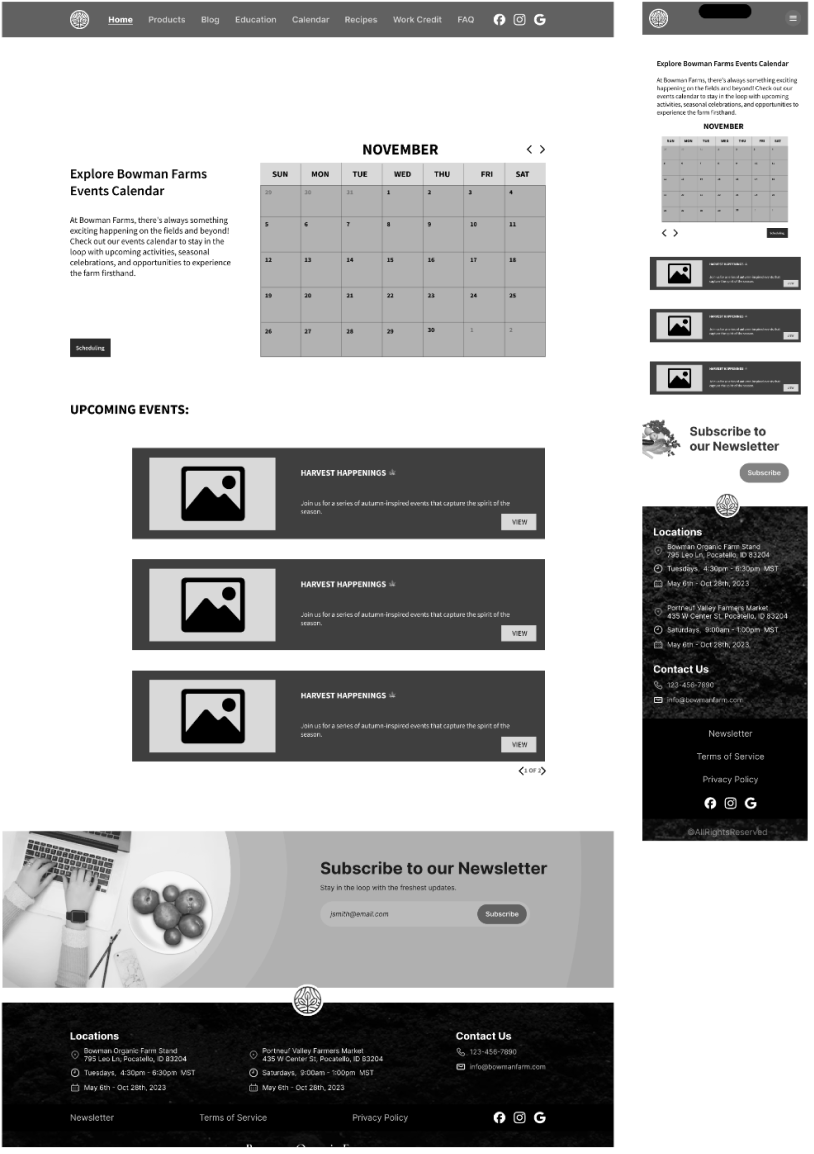
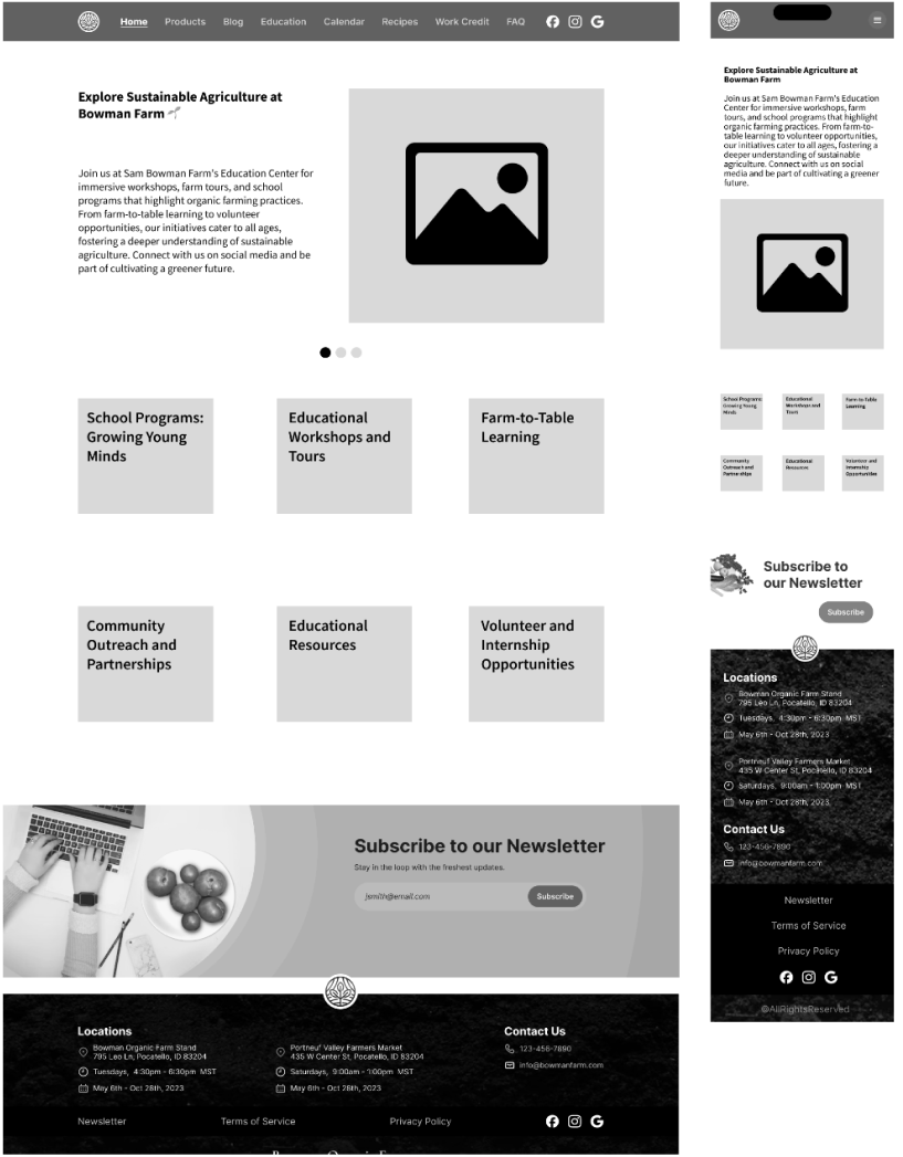
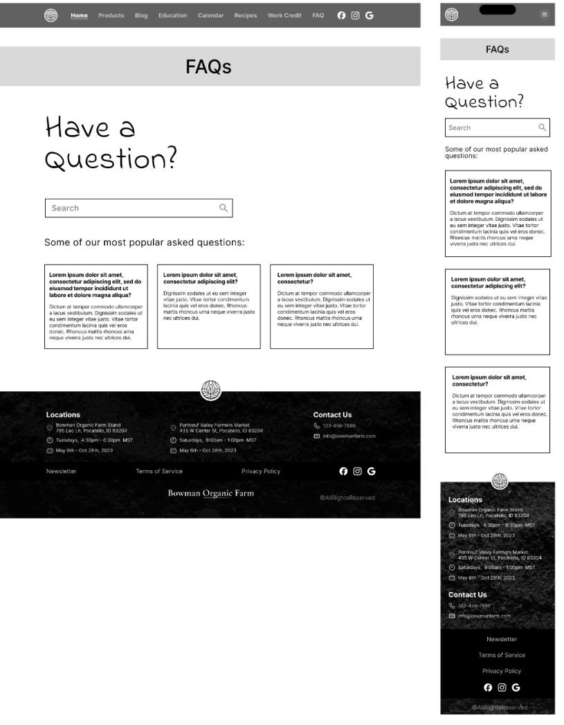
These digital greyscale renderings offer a more detailed layout, serving as a refined blueprint for the product’s design.
User Experience Design
User Interface Design is the aesthetic discipline that dictates how a product visually communicates with its users.
The process kicks off with the creation of mood boards, serving as visual compasses that help define the product’s overall look and feel.
This initial step is instrumental in shaping a cohesive visual language, setting the stage for the subsequent design elements.
Moodboard
Curated visual inspirations into a moodboard to define aesthetic direction and inform design elements.
Style Guide
Established a style guide to solidify design principles, typography, and color schemes for visual consistency.
User Interface
A versatile and engaging user interface that seamlessly transitions between mobile and desktop platforms.
Customer Review
Our collaboration with Bowman Farm was marked by effective communication and a commitment to their vision. Despite challenges, we delivered a solution that exceeded expectations, earning a rating of 9/10 from the client. Their praise for our responsiveness, attention to detail, and ability to bring their ideas to life motivates us to continue delivering exceptional results
Contact
Have dreams of a custom digital presence? Let’s make it happen. Talk soon!
Hit submit and consider us talking.
One business day max.
850.225.3665
hey@neaux.design


