How I led the redesign of iHerb, uniting clean design with an immersive e-commerce features.
Summary
In the bustling e-commerce health sector, I led iHerb's digital revamp to stand out for trust and variety. Guided by market insights, we honed a user-centric platform attuned to wellness trends. iHerb's refined interface and curated products now offer a seamless shopping experience, proving that digital innovation can create a compelling health marketplace.
Every facet of the iHerb site was meticulously crafted, from a streamlined user interface to a robust product suite, all to ensure a seamless and enriching shopping journey. The transformation transcended a mere website upgrade; it became a testament to how digital innovation can foster a holistic and engaging consumer health marketplace.
Responsibilities
Roles
Strategy
Competitive Research
Quantitative Research
Qualitative Research
User Personas
UX & Visual Aids
Prototyping
Customer Engagement
UX Designer
UI Designer
Researcher
Tools
Figma
Procreate
Heycollab
Google Slides
Challenge
iHerb faced the challenge of differentiating itself in the saturated online marketplace of health and wellness products, where establishing consumer trust and a vast product assortment is paramount.
Solution
We crafted an intuitive e-commerce platform for iHerb that emphasizes reliability and a diverse selection. This solution not only improved user engagement but also fortified iHerb's reputation as a go-to source for health products, fostering strong customer relationships.
Process
Market Research: Competitive
To gain insights into the digital presence of other local market farms, we carried out competitive research focusing on three key areas: demographics, geographic distribution, and Niche.
Demographics
All ages, but primarily 30-60
More female than male
mostly English speaking
Geography
Primarily North America
Some in South America
Some in Asia
Niche
Groceries
Supplements
Vitamins
Loyalty Programs
Market Research: Qualitative
To gain insights into the digital presence of other local market farms, we carried out quantitative research focusing on three key areas: demographics, visit metrics, and device distrobution.
Demographics
Visit Metrics
Devices
Market Research: Qualitative
I’ve conducted qualitative research to delve into human behaviors and attitudes. This has involved surveying prospects, holding user interviews, and synthesizing the gathered information.
I’ve used these insights to craft empathy maps and user personas, thereby gaining a nuanced understanding of user needs and motivations
Surveys
Surveys
In my research, I polled 20 patrons of iHerb to gauge the features and information they desire from an e-commerce site. The data was clear: every individual indicated they wanted three functions.
Research oriented results, product variety, and a personalized experience.
Synthesis
Better mobile app interface
Faster / repeatable visit options
More deals
Great products
Good information
Data showed the following suggestions:
Empathy Maps
Through categorizing interview-derived user pain points by thoughts and feelings, visual cues, spoken words, and actions, I was able to systematically organize each issue based on its distinct features.
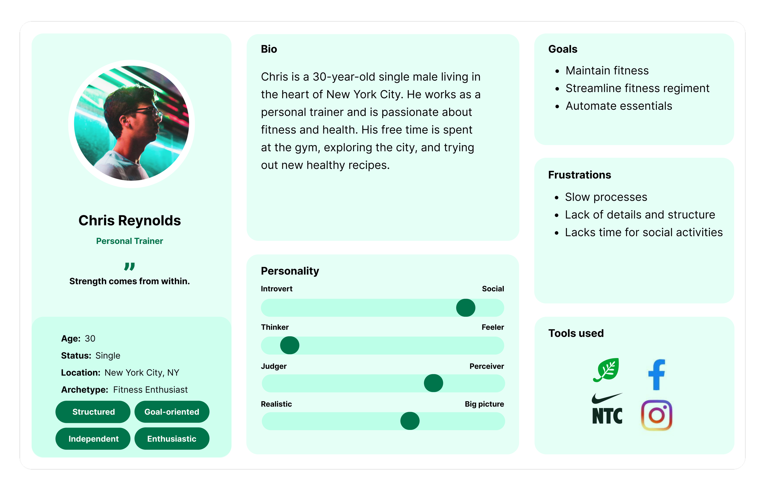
User Personas
From interviews and user research, I developed user personas that outlined details like age range, occupation, and interests.
These profiles also highlighted commonly used apps, objectives, and pain points.
User Experience Design
User Experience Design is the scientific art of crafting the blueprint behind a product’s functionality.
It lays the groundwork for how a user interacts with a product by methodically planning its information architecture, sitemaps, user flows, and both low and high-fidelity wireframes.
This stage is crucial for vetting different hypotheses through usability testing, ensuring the product not only meets but exceeds user expectations.
Information Architecture
Information architecture played a pivotal role when we aimed to consolidate various functionalities, usually scattered across multiple products, into a single tool. We recognized early on that without meticulous planning, the tool would become too complex for easy adoption and usage.
User Flows
Armed with a well-defined sitemap that provided a macro-level view, we then honed in on mapping out the specific routes and user flows within the platform. This more granular focus allowed us to ensure a seamless navigation experience across the entire ecosystem.
Low-fidelity Wireframes
Low-fidelity wireframes serve as rapid iterations to vet the product’s functionality methodologies.
High-fidelity Wireframes
These digital greyscale renderings offer a more detailed layout, serving as a refined blueprint for the product’s design.
User Experience Design
User Interface Design is the aesthetic discipline that dictates how a product visually communicates with its users.
The process kicks off with the creation of mood boards, serving as visual compasses that help define the product’s overall look and feel.
This initial step is instrumental in shaping a cohesive visual language, setting the stage for the subsequent design elements.
Moodboard
Curated visual inspirations into a moodboard to define aesthetic direction and inform design elements.
Style Guide
Established a style guide to solidify design principles, typography, and color schemes for visual consistency.
User Interface
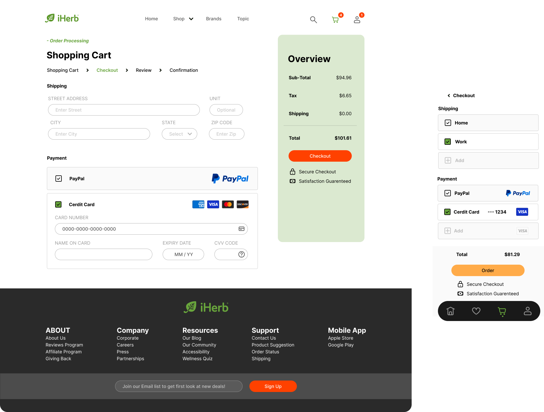
A versatile and engaging user interface that seamlessly transitions between mobile and desktop platforms.
Contact
Have dreams of a custom digital presence? Let’s make it happen. Talk soon!
Hit submit and consider us talking.
One business day max.
850.225.3665
hey@neaux.design


