How I led the creation of the hiking social media app, Sekr, uniting intuitive design and robust features.
Summary
In the bustling world of outdoor social platforms, I led the charge in developing Sekr (SEEK-R), a social media app tailored for hiking enthusiasts. Positioned against giants like AllTrails and Instagram, our mission was ambitious yet clear: to forge a unique digital space that champions the spirit of adventure and community. This journey was grounded in deep market analysis and user insights, steering every facet of Sekr’s creation.
Every component of Sekr was meticulously designed, from its user-friendly interface to its rich feature set, all aimed at enhancing the connection between hikers worldwide. The outcome is more than just an app; it's a community hub where the thrill of discovery and the warmth of shared experiences thrive. Sekr stands as a vibrant testament to how digital innovation can unite nature lovers across the globe.
Responsibilities
Roles
Strategy
Competitive Research
Quantitative Research
Qualitative Research
User Personas
UX & Visual Aids
Prototyping
Customer Engagement
UX Designer
UI Designer
Researcher
Tools
Figma
Procreate
Heycollab
Google Slides
Challenge
Sekr (SEEK-R) faced the dual challenge of entering a market dominated by established apps like AllTrails and Instagram, needing to captivate a niche audience of hiking enthusiasts with unique features that stand apart.
Solution
We engineered an interface designed to foster a vibrant community around hiking. By integrating trail discovery with social connectivity, we offered users a unique blend of exploration and engagement, positioning Sekr as the go-to app for outdoor adventurers seeking like-minded individuals and new trails.
Process
Market Research: Competitive
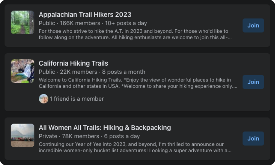
To gain insights into the digital presence of other local market farms, we carried out quantitative research focusing on four key areas: user analytics, user demand, and opportunity.
User Analytics
No analytics available
However, countless hiking pages/groups
Averaging 22k members
User Demand
Countless hiking apps
Averaging 500k users
AllTrails, alone, touts 20M users
Opportunity
AllTrails is competitively hiring
Positions are indicative of growth
Market Research: Qualitative
I’ve conducted qualitative research to delve into human behaviors and attitudes. This has involved surveying prospects, holding user interviews, and synthesizing the gathered information.
I’ve used these insights to craft empathy maps and user personas, thereby gaining a nuanced understanding of user needs and motivations
Surveys
In my study targeting Sekr users, I surveyed 20 enthusiasts to understand what draws them to the app. From the 15 responses received, it was evident: users consistently sought out Sekr for three specific features.
Interviews
Despite reaching out to 36 individuals surveyed, we encountered a situation where no participants volunteered for follow-up interviews, reflecting a unique challenge in engaging deeper insights.
Synthesis
Frustration over the current need for multiple applications to plan, share, and rate travel experiences
A desire to collaborate freely with family and friends
Interests in local history, culture, and people
Conscious of safety and the possible need for emergency assistance
Reviews from each other to pick the best experiences
Data showed the following suggestions:
Empathy Maps
Through categorizing interview-derived user pain points by thoughts and feelings, visual cues, spoken words, and actions, I was able to systematically organize each issue based on its distinct features.
Market Research: Qualitative
From interviews and user research, I developed user personas that outlined details like age range, occupation, and interests.
These profiles also highlighted commonly used apps, objectives, and pain points.
User Experience Design
User Experience Design is the scientific art of crafting the blueprint behind a product’s functionality.
It lays the groundwork for how a user interacts with a product by methodically planning its information architecture, sitemaps, user flows, and both low and high-fidelity wireframes.
This stage is crucial for vetting different hypotheses through usability testing, ensuring the product not only meets but exceeds user expectations.
Information Architecture
Information architecture played a pivotal role when we aimed to consolidate various functionalities, usually scattered across multiple products, into a single tool. We recognized early on that without meticulous planning, the tool would become too complex for easy adoption and usage.
User Flows
Armed with a well-defined sitemap that provided a macro-level view, we then honed in on mapping out the specific routes and user flows within the platform. This more granular focus allowed us to ensure a seamless navigation experience across the entire ecosystem.
Low-fidelity Wireframes
Low-fidelity wireframes serve as rapid iterations to vet the product’s functionality methodologies.
High-fidelity Wireframes
These digital greyscale renderings offer a more detailed layout, serving as a refined blueprint for the product’s design.
User Experience Design
User Interface Design is the aesthetic discipline that dictates how a product visually communicates with its users.
The process kicks off with the creation of mood boards, serving as visual compasses that help define the product’s overall look and feel.
This initial step is instrumental in shaping a cohesive visual language, setting the stage for the subsequent design elements.
Moodboard
Curated visual inspirations into a moodboard to define aesthetic direction and inform design elements.
Style Guide
Established a style guide to solidify design principles, typography, and color schemes for visual consistency.
User Interface
A versatile and engaging user interface that seamlessly transitions between mobile and desktop platforms.
Contact
Have dreams of a custom digital presence? Let’s make it happen. Talk soon!
Hit submit and consider us talking.
One business day max.
850.225.3665
hey@neaux.design


